Fluid Engine Tablet Spacing Fixer
Makes Squarespace's mobile breakpoint larger so that you can fix Fluid Engine spacing issues on screen sizes between mobile & tablet
Co je Fluid Engine Tablet Spacing Fixer?
Fluid Engine Tablet Spacing Fixer je rozšíření Chrome vyvinuté https://schwartz-edmisten.com, a jeho hlavní funkcí je „Makes Squarespace's mobile breakpoint larger so that you can fix Fluid Engine spacing issues on screen sizes between mobile & tablet“.
Snímky obrazovky rozšíření
Stáhnout soubor CRX rozšíření Fluid Engine Tablet Spacing Fixer
Stáhněte si soubory rozšíření Fluid Engine Tablet Spacing Fixer ve formátu crx, ručně nainstalujte rozšíření Chrome do prohlížeče nebo sdílejte soubory crx s přáteli, abyste jednoduše nainstalovali rozšíření Chrome.
Pokyny pro Použití Rozšíření
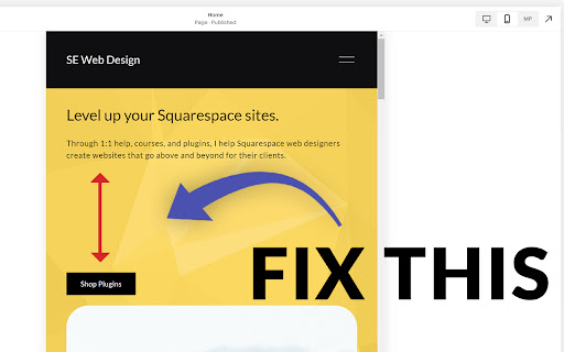
If you are using Squarespace 7.1's new Fluid Engine editor, you might have noticed that your text blocks get TONS of space between them on screen sizes between 600px and 767px (between mobile and tablet) with no way to remove it.
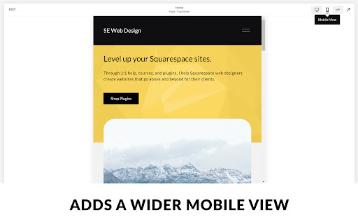
This is because of the way Fluid Engine maps blocks to the grid. The remedy is to map blocks to the grid on a screen size of 767px. When mapping them at this width, the spacing issues are resolved.
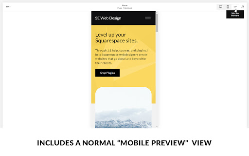
This extension automatically makes your 7.1 site's mobile view 767px wide, so you don't have to resize the window yourself. It also provides a "mobile preview" mode, that shows the original mobile view in additional to the 767px editing view, so you can see what your site looks like across more screen sizes.
This will provide a much needed fix until (hopefully) Squarespace gives us an editable tablet view in the future. Then at that time you can uninstall this extension. Základní Informace o Rozšíření
| Název |  Fluid Engine Tablet Spacing Fixer Fluid Engine Tablet Spacing Fixer |
| ID | gemmfnoajaghnaddkccmekbchdgckdab |
| Oficiální URL | https://chromewebstore.google.com/detail/fluid-engine-tablet-spaci/gemmfnoajaghnaddkccmekbchdgckdab |
| Popis | Makes Squarespace's mobile breakpoint larger so that you can fix Fluid Engine spacing issues on screen sizes between mobile & tablet |
| Velikost souboru | 9.33 KB |
| Počet instalací | 1,203 |
| Aktuální Verze | 0.1.5 |
| Poslední Aktualizace | 2023-08-03 |
| Datum Vydání | 2022-09-22 |
| Hodnocení | 4.89/5 Celkem 9 Hodnocení |
| Vývojář | https://schwartz-edmisten.com |
| [email protected] | |
| Typ Platby | free |
| Webové stránky Rozšíření | https://schwartz-edmisten.com |
| URL Stránky Nápovědy | https://schwartz-edmisten.com/fluid-engine-tablet-spacing-support |
| Podporované Jazyky | en-US |
| manifest.json | |
{
    "update_url": "https:\/\/clients2.google.com\/service\/update2\/crx",
    "name": "Fluid Engine Tablet Spacing Fixer",
    "description": "Makes Squarespace's mobile breakpoint larger so that you can fix Fluid Engine spacing issues on screen sizes between mobile & tablet",
    "version": "0.1.5",
    "manifest_version": 3,
    "permissions": [
        "scripting",
        "activeTab"
    ],
    "host_permissions": [
        "*:\/\/*.squarespace.com\/config*"
    ],
    "content_scripts": [
        {
            "matches": [
                "*:\/\/*.squarespace.com\/config*"
            ],
            "css": [
                "style.css"
            ],
            "js": [
                "script.js"
            ]
        }
    ],
    "action": {
        "default_popup": "popup.html",
        "default_title": "Fix Fluid Engine Tablet Spacing"
    },
    "icons": {
        "16": "images\/icon16.png",
        "32": "images\/icon32.png",
        "48": "images\/icon48.png",
        "128": "images\/icon128.png"
    }
} | |