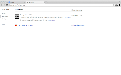
Breakpoint
The easiest way to find the break points in your responsive web designs.
Breakpoint란 무엇입니까?
Breakpoint은(는) Filip Johansson에 의해 개발된 Chrome 확장 프로그램으로, 주요 기능은 "The easiest way to find the break points in your responsive web designs."입니다.
확장 프로그램 스크린샷

Breakpoint 확장 프로그램 CRX 파일 다운로드
크롬 확장 프로그램을 crx 형식으로 다운로드하여 브라우저에 수동으로 설치하거나 crx 파일을 친구들과 공유하여 쉽게 크롬 확장 프로그램을 설치하세요.
확장 프로그램 사용 설명서
                        Breakpoint lets you use your keyboard to resize your browser window - one pixel at a time. Therefore it is the perfect companion when you are trying to find the exact pixel where your responsive websites break.

How to use
These are the default settings, you can change them in "Window" > "Extensions", then scroll down to the bottom and to the right you will find "Keyboard Shortcuts".
Please note: Since Chrome version 29 these are not set by default anymore! You now have to set them manually when you install the extension.

Alt + Left Arrow: Decrease the width of the window by 1px
Alt + Right Arrow: Increase the width of the window by 1px
(Add Shift to any of the combinations to change it by 10px)

Breakpoint also has the ability to change the height of the browser window, but you have to manually activate it in "Window" > "Extensions" > "Keyboard Shortcuts".

When you find the break point you are looking for the tiny icon in the toolbar will tell you the exact size of you browser window.
확장 프로그램 기본 정보
| 이름 |  Breakpoint Breakpoint |
| ID | jakokfjpnhpnhilgnlnkaihmkhdfhhmh |
| 공식 URL | https://chromewebstore.google.com/detail/breakpoint/jakokfjpnhpnhilgnlnkaihmkhdfhhmh |
| 설명 | The easiest way to find the break points in your responsive web designs. |
| 파일 크기 | 8.21 KB |
| 설치 횟수 | 1,943 |
| 현재 버전 | 1.0.2 |
| 최근 업데이트 | 2016-11-06 |
| 출시 날짜 | 2016-11-06 |
| 평점 | 2.71/5 총 31 개의 평점 |
| 개발자 | Filip Johansson |
| 결제 유형 | free |
| 지원되는 언어 | en |
| manifest.json | |
{
"update_url": "https:\/\/clients2.google.com\/service\/update2\/crx",
"name": "Breakpoint",
"version": "1.0.2",
"manifest_version": 2,
"description": "The easiest way to find the break points in your responsive web designs.",
"offline_enabled": true,
"icons": {
"16": "icons\/icon16.png",
"48": "icons\/icon48.png",
"128": "icons\/icon128.png"
},
"background": {
"scripts": [
"src\/bg\/background.js"
],
"persistent": true
},
"content_scripts": [
{
"matches": [
" | |